Turning Visitors into Customers by Optimising Website Usability
Late September 2018, I was invited to moderate a web usability panel discussion in e2eCommerce Indonesia. The speakers were: Sandy Julian (Lead Design) of Sejasa, Melody Budiono (UX Manager) of Blibli, Richard Fang (CEO & Co-founder) of Moselo.
The event title was “Turning Visitors into Customers by Optimising Website Usability”. It’s a cliché title with gimmicky feel into it. We all know turning visitor to customer is not enough by just covering the website usability aspect. There are a lots of other factors, the most important one is desirability. As we touched the desire topic, it is an easy pill-to-swallow if our competitors are either dying or dead. On prime fitness, they are hacking their way by throwing hard to resist good deals to customers. This cash burning action will always distract a visitor to become a customer.
Anyway, on the stage I was just pretend web usability will instantly turn a website into a big hit. After all, it was an eCommerce event.
Pre-exercising crowd muscles
The Tango of Web Usability, User Interface, and User Experience
I’m no expert in the topic, but the default panel questions were so biased. It was not purely usability. i.e:
- Tips and strategies to ensure UX stays up-to-date with customer preferences and expectations?
- Marrying UX (features) and UI (design) to draw and keep customers in your website
- UX+UI from a talent and skills perspective – is the hybrid UX/UI designer essential?
So I changed them all into something like these:
- Can you tell us your findings when trying to improve conversion in service marketiplace VS. product?
- Tell us your hustles when designing navigation, the experiements, fail and success?
- What’s the general rule of thumb to make sure Indonesian users accomplish basic tasks the first time they encounter the navigation design?
- What is your views on sacrificing good art (UI design) with something that is not so good, because the usability or conversion rate is lower in good art? e.g killing beautiful tall banner that pushes all important stuffs down? (wasting Above the Fold)
- How do you ensure smooth customer experience, from browsing to check-out?
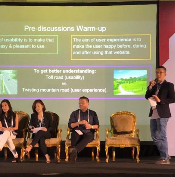
I tried my best to drag it down to usability. Realised the meanings and jargons has been mixed up through out the years, I made this pre-discussion warm up and slap it to the big screen:
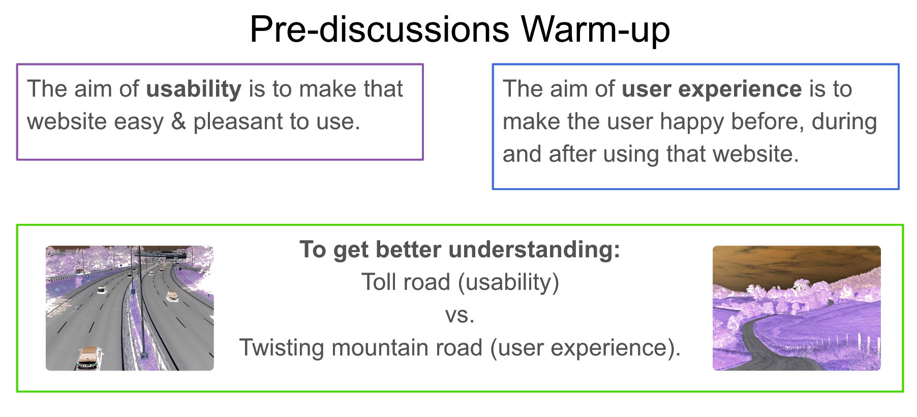
Toll road: Less traffic, faster moving from point A to B, easy and pleasant “to use”, require little learnability → Highly usable but low user experience (boring).
Twisting mountain road: Hear, see, smell the mother nature, excitement of uphill downhill ride → Awesome experience.
What are Usability, Utility & Useful?
Utility = whether it do what users need.
eg. Jane needs to draw cash from ATM. ATM draws her cash.
Usability = how easy & pleasant to use these features.
eg. According to Jane, the ATM was very easy to use, but she had a little pause when she wanted to skip the intro advertisement.
Usability + Utility = Useful
Confusing to use eCommerce website + Correct Product/service delivered to customer = Not Useful
Web Usability is part of Experience
In terms of a website:
The aim of usability is to make that website easy to use.
The aim of user experience is to make the user happy before, during and after using that website.
Defined as Metaphor:
Toll road (usability) vs. Twisting mountain road (user experience).
Usability in eCommerce
“The first law of ecommerce is that if users cannot find the product, they cannot buy it either.”
– Jakob Nielsen.
On the Web, usability is a necessary condition for survival. If a website is difficult to use, people leave. If users get lost on a website, they leave. If a website’s information is hard to read or doesn’t answer users’ key questions, they leave.
There’s no such thing as a user reading a website manual or otherwise spending much time trying to figure out an interface. There are plenty of other websites available; leaving is the first line of defense when users encounter a difficulty.
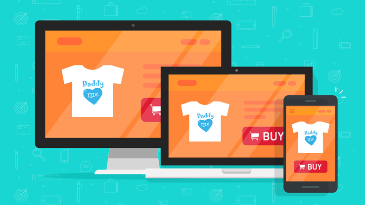
In Indonesia, eCommerce transactions are 34% from PC, and 33% from mobile. This clearly shows mobile small screen traffic growth is beating PC / desktop traffic. Serving and treating small screens with red carpet in your eCommerce site is a must. In fact, creating design thinking mockup should be done in mobile first, PC version later 🙂
Off the stage we go

